the jupyter notebook as a sandbox for code
The Jupyter Notebook web application that I mentioned in the previous post has been snowballing in popularity lately, especially among data scientists, and in this post I wanted to introduce some of the really useful things you can do with it.
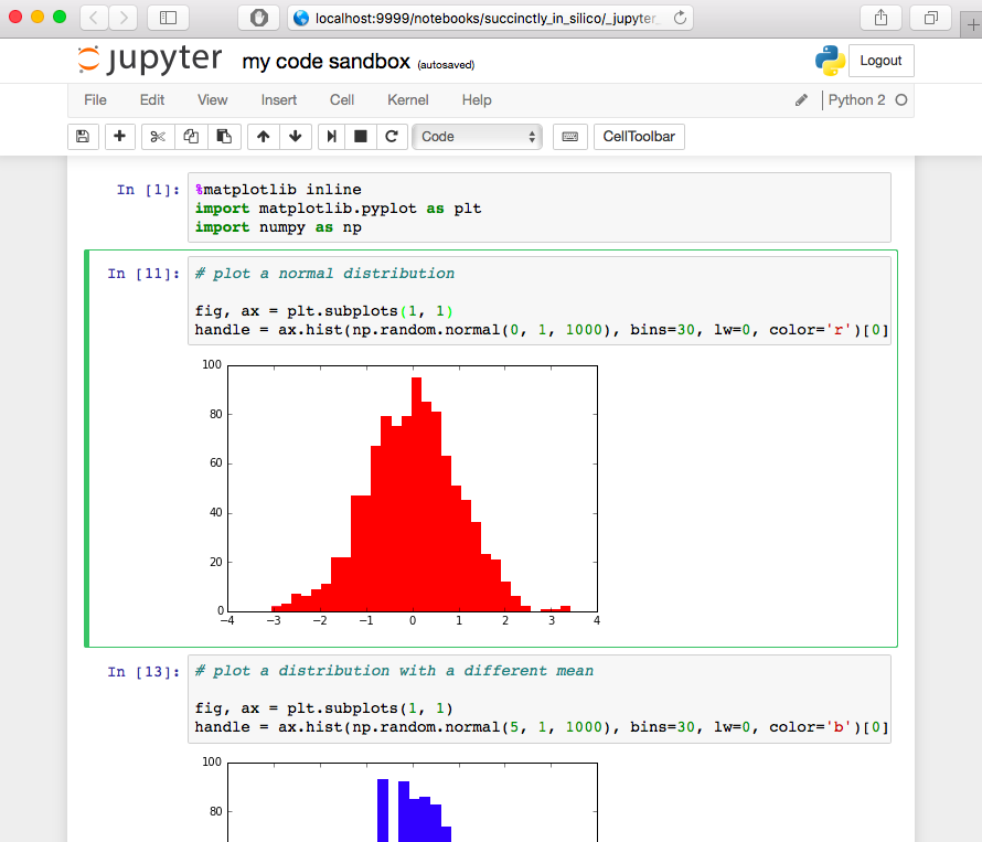
For those of you that haven’t heard of the Jupyter Notebook, it’s an application that uses the web browser as its interface and looks something like this:
Basically, it allows you to type up little blocks of code called cells, run them, and view textual, graphical, and even interactive results directly inside your web browser. These features make it perfect for use as a code sandbox, that is, an environment where you “mess around” that’s separate from your main codebase. For example, in just the past week I used my code sandbox to figure out how to extract the path of one directory relative to another, to slice an array according to two different conditions, to organize a figure’s subplots so that they span multiple columns, to display a transparent cylinder on a 3D plot, to load data from a database, to plot a few rows of a biological dataset, to format a datetime string exactly how I wanted, and to retrieve the traceback when an exception was raised. And a reliable code sandbox is a nice place to go for all of these miscellaneous tasks.
While in principle you can use other environments as a sandbox, I’ve found Jupyter to be far superior for a number of reasons.
- Because the code lives in a modifiable notebook, it is very easy to change and rerun it as many times as you like. Doing this using a command line interpreter, for instance, (the code sandbox I was first introduced to) can be a huge pain, especially if you want to rerun code snippets with multiple lines and with specific indentation structure.
- Scientists want to see plots, but setting up a graphical backend with either a command line interpreter or even a full blown IDE can be a real nuisance, and it can take some finagling to make your plots show up at all. Further, if you don’t set it up perfectly, the graphical backend can have a bunch of side effects. For example, figures could prevent your code from continuing to run or multiple figures could interfere with each other so that only certain ones actually get drawn on the screen, to name a few things that have given me headaches in the past. In Jupyter on the other hand, all of the graphics are taken care of in the web browser. If you’re using Python, you only need to make sure you’ve entered
%matplotlib inline(or%matplotlib notebookif you want to be able zoom and pan) before making a figure and it will show up nice and neat in right below the code cell in the browser window. - Using a web browser for figures is also very nice when you want to make a really big figure (say, making a couple different plots for each of 50 datasets in order to look for anomalies). Instead of resizing it and displaying the figure in its own window like an IDE might, Jupyter simply draws the figure in the web browser, and you can scroll up and down through the whole thing as you’d scroll through any other webpage. To me, this has always felt much easier to navigate than a PDF or a giant JPG or PNG.
- Jupyter Notebooks make it extremely easy to surround your figures or results with descriptions or captions that would otherwise require third-party software or complicated graphical commands if you were to attempt the same in the command line or a standard IDE. In Jupyter, on the other hand, you can simply create a markdown cell above/below your results and include anything from nicely formatted text to images to equations written in TeX.
In summary, I’ve found the Jupyter Notebook to be a great code sandbox when I’m just messing around trying to figure out how to write the code for small, miscellaneous tasks. If you want to try out Jupyter or install it on your computer, simply follow the instructions on their website.
Next time I’ll talk about another great use I’ve found for Jupyter in science, which is as an interface to a larger codebase.